AgCulture Marketing is a boutique, agriculturally focused marketing agency. Starting from scratch, I helped build this company from the ground up alongside a talented, hand picked team.

Origins
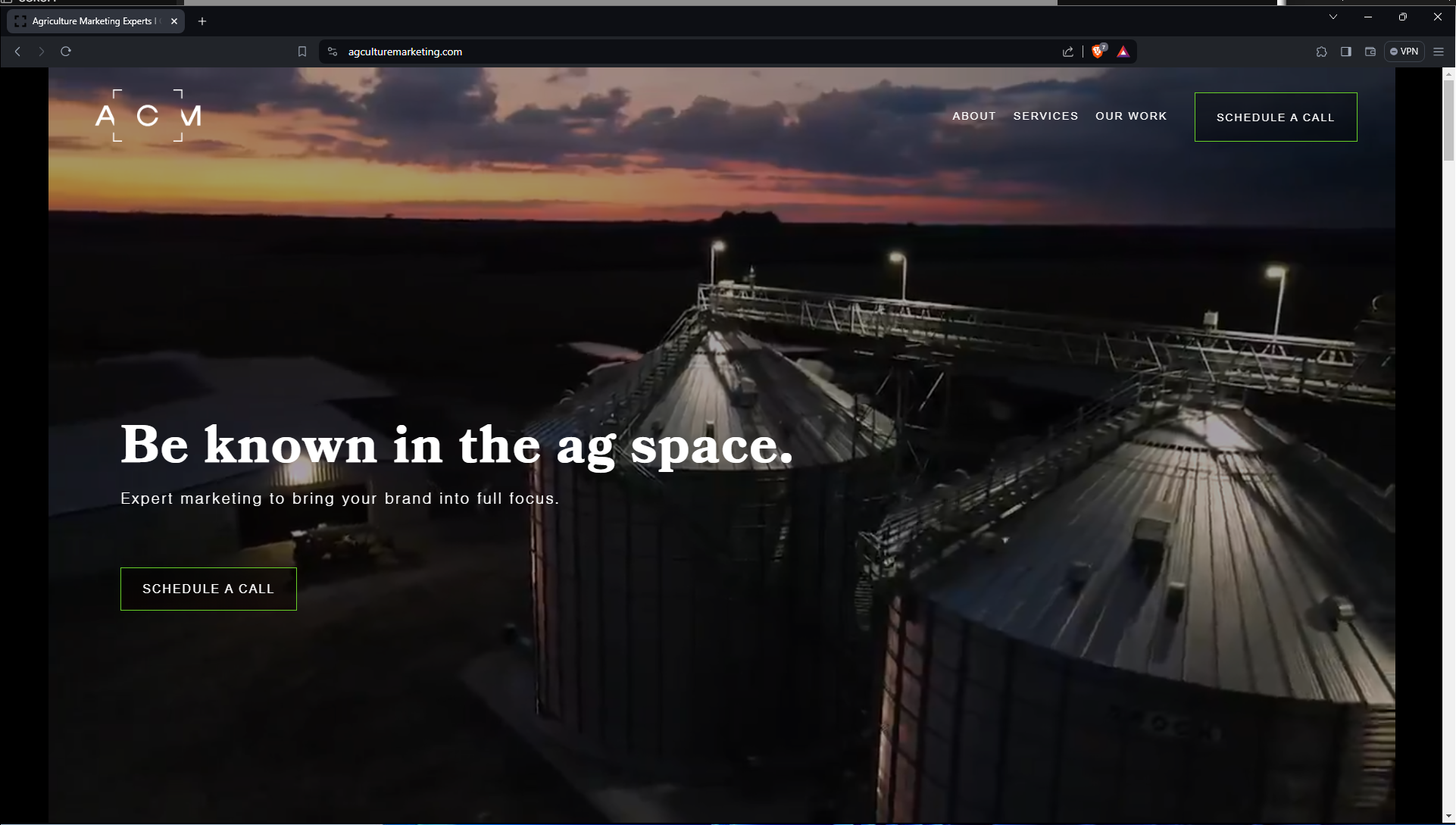
Starting as a freelancer, I joined AgCulture “media” to do some design work alongside a video editor and the business owner. We had a handful of small clients at the time and we delivered above and beyond. As things progressed and we began to get recognized word-of-mouth, the petitions for a rebrand were made and I began working to change the logo shown here.
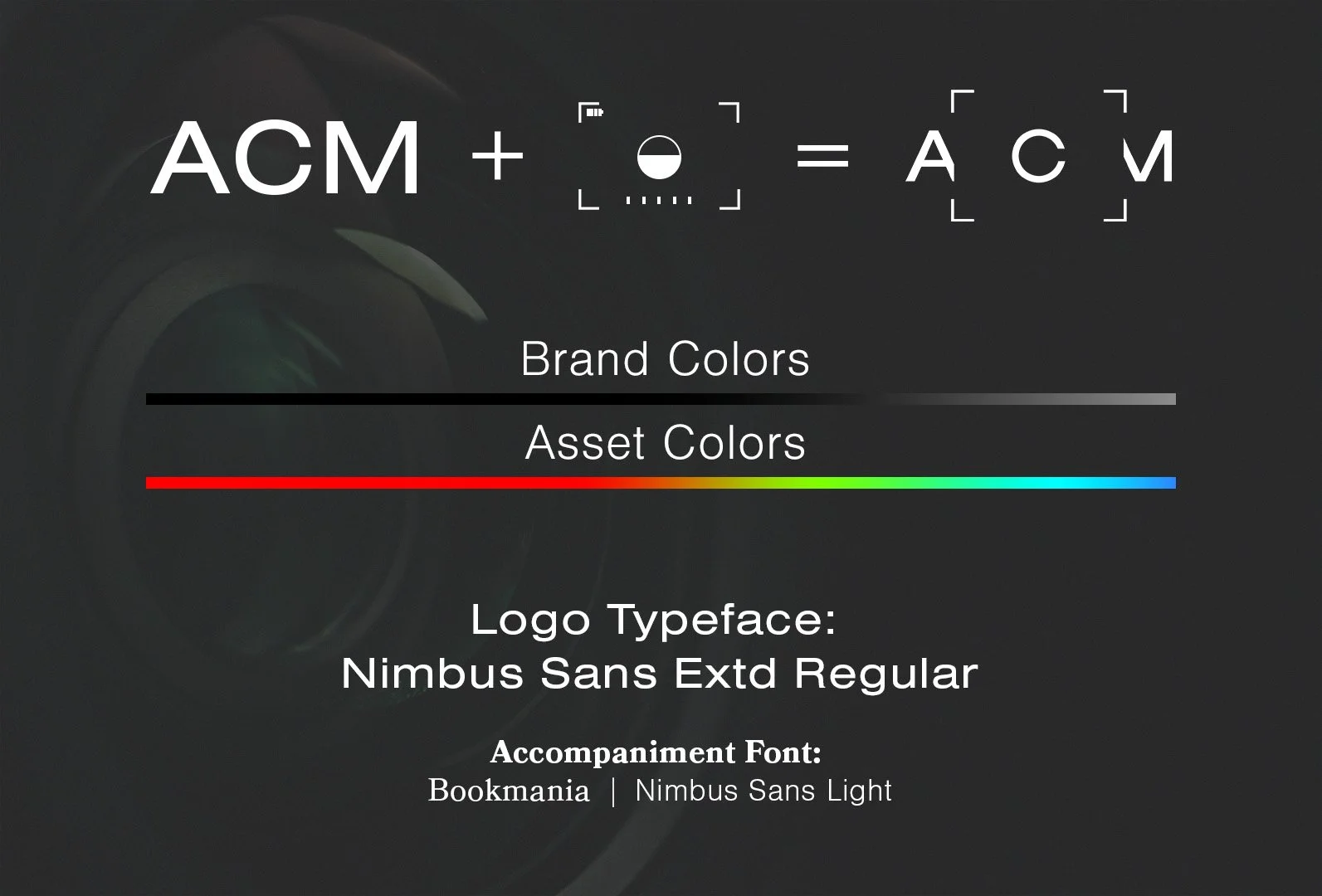
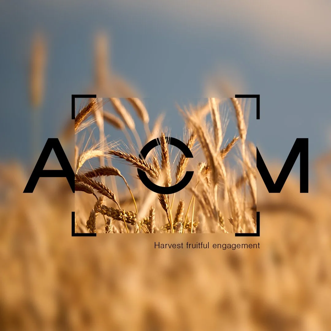
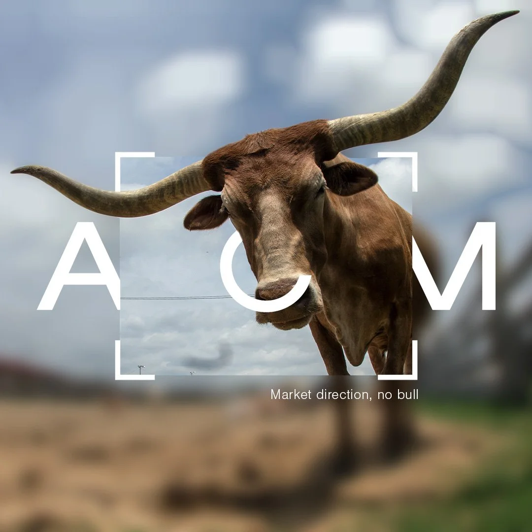
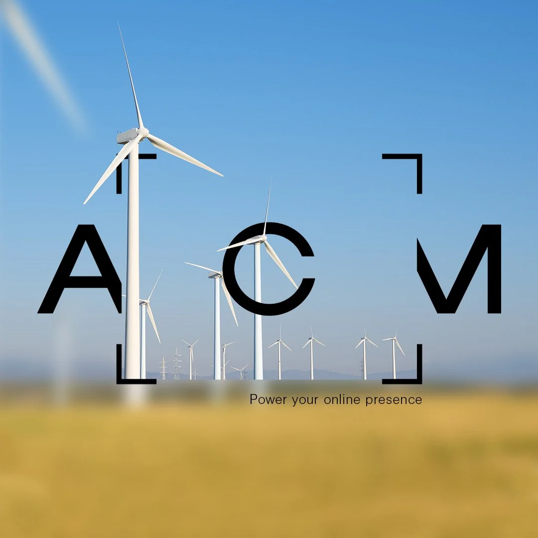
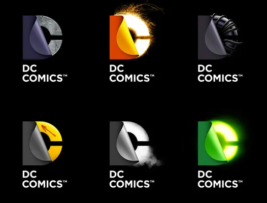
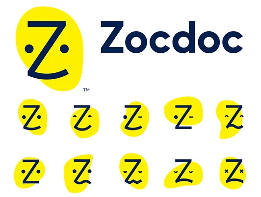
Logo systems
A logo system is a logo that transcends the static pictograph that we’re used to seeing. With new capabilities digitally, logo have more freedom to be expressive and dynamic. This can be seen in a few examples below:
-
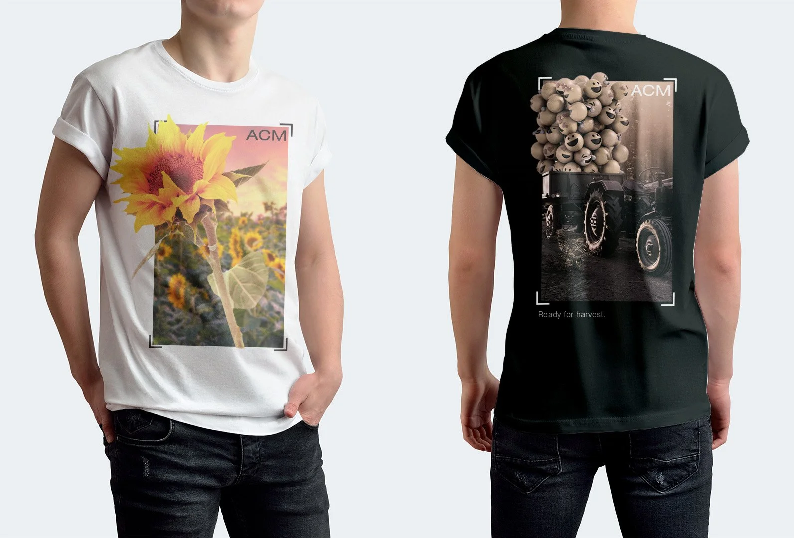
The challenge of a traditional logo in this case was the presupposed imagery. When you think of “agriculture”, you think of tractors, corn, farmers, etc. but what about media/marketing? What would be recognizable as “content creators” from a visual perspective? How can I mix agriculture and media imagery together so that anyone viewing the logo would know what the company does, immediately and without context?
-
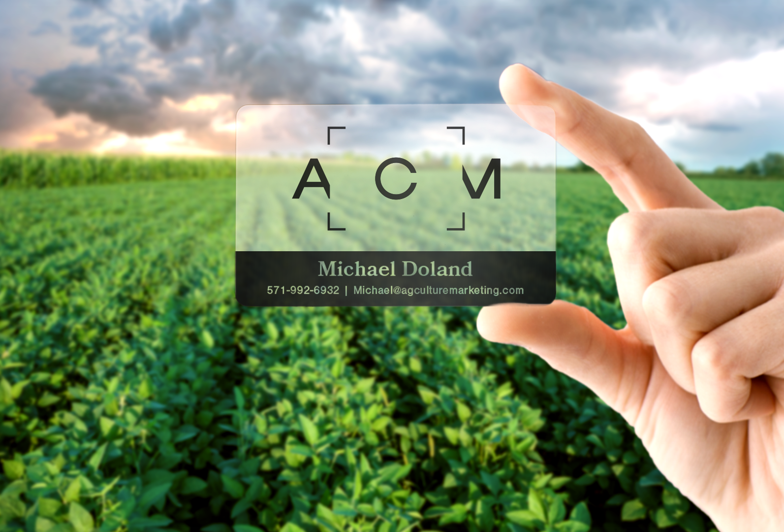
My answer was to create a logo system that used .he powerful agriculture imagery, but support it with our media focused logo. This logo interacts dynamically with the content and works into the image’s ecosystem. This way, the rut of “agriculture-focused motif, media secondary” is eliminated and we can .et more creative with logo ideas. This took time and didn’t come as a solution until the final version.
-
After rebranding ACM and solidifying our brand style, we were able to explode with new opportunities and personnel. Shortly after making the new brand style we earned enough business to hire seven new people and we continue with that momentum today.


With the increase in business, I assumed the role of Creative director and hired
The Branding